Design Smarter, Not Harder: The Power of Integrated Content Standards
Robinhood was founded on a simple idea: that our financial markets should be accessible to all. With customers at the heart of our decisions, Robinhood is lowering barriers and providing greater access to financial information and investing. Together, we are building products and services that help create a financial system everyone can participate in.
…
At Robinhood, we’re constantly striving to enhance our products and processes, and the journey to integrate our Content Standards into our design system was no exception. We’re thrilled to introduce Jessi Field-Sierra, a content designer who played a pivotal role in leading this initiative. This endeavor stemmed from a profound realization: our well-constructed design system didn’t reflect our current Content Standards, creating challenges for both content and product designers. In this blog, we’ll explore the unique opportunity we seized, the meticulous process that followed, and the transformative results of this integration. Join us as we learn how this endeavor has empowered our designers to work faster, smarter, and more consistently, ultimately driving our commitment to providing the best possible experience for our users.
…
Hey, I’m Jessi! I’m a content designer who’s been at Robinhood since March 2022. During my time here, I’ve designed content for our customer referral programs, peer-to-peer payment system, crypto products, and more. But one of the most exciting projects I’ve worked on wasn’t product-specific—it was as a member of our Content Committee, where I led the effort to integrate Robinhood’s Content Standards into our design system.
The opportunity
Our otherwise well-built design system—lovingly named Bento—lacked guidance from our Content Standards, and often contradicted them. Bento was built when our Content Design team was still in its early stages, and although our Content Design team and Content Standards have grown up speedily, we hadn’t paused to bring Bento into alignment. This meant that:
- Content designers had to cross-reference between Bento files and our Content Standards documentation, which required lots of time-sucking context switching
- Product designers or product managers were left guessing on the best ways to create effective content when they didn’t have content design support (it’s not ideal, but it happens)
- Stylistic inconsistencies trickled down into our products, which content designers later had to correct. For example, title case and sentence case buttons lived side-by-side, and headers used punctuation inconsistently
- There was a general lack of clarity on which component was the best delivery method for content
Robinhood’s Content Committee saw an opportunity.
The Content Committee, made up of writers from across the company, makes informed decisions on Content Standards that can be used across all teams at Robinhood. They also make sure these decisions are codified into patterns that can be reused easily by all content designers, product designers, and other content creators. The Committee realized that, by integrating our Content Standards into Bento, we could meet designers where they are and help them design faster, smarter, and more consistently.
The process
Assembling a task force
As a member of the Committee, I raised my hand to coordinate and help implement this integration. This required the help of 12 Committee members, who graciously volunteered their time to comb through dozens of design files, documented standards, and design system components. It also required help from the Bento team, who met with us regularly and constantly had to review and merge changes to the main Figma file (big shout out to our systems product designer Neil LaVigne).
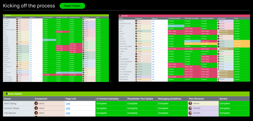
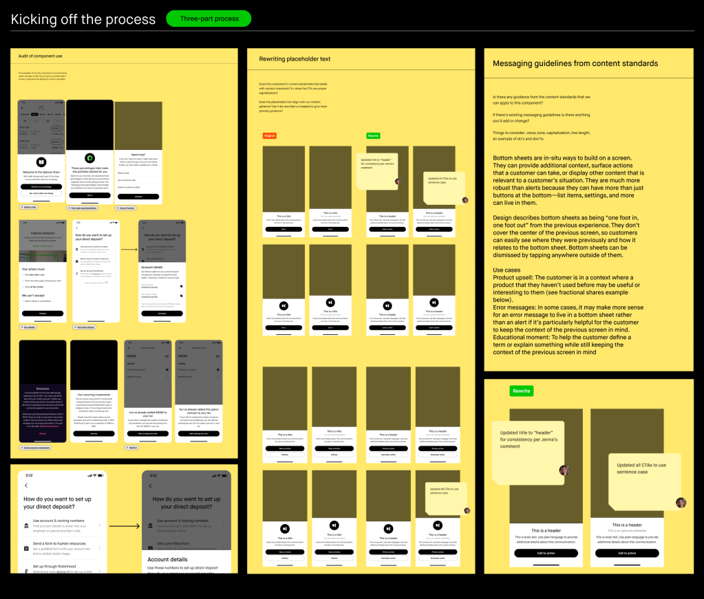
Kicking off the process
The Committee thought about the different ways content design could have an impact and influence Bento. We created three main steps to achieve this integration.
I kept team members accountable by creating a project tracker in Figma. The tracker was created from component variables, which allowed me and other members to easily update it. We used it to assign Bento components to members, update project status, and link out to relevant frames. It also came in handy when we implemented peer reviews.
Here’s a breakdown of our steps:
- Audit existing components – First we needed to see how our design system components were already being used “in the wild.” How many titles are written in sentence case like they’re supposed to be? Are calls to action (CTAs) being used effectively? Is the right content being used in each component?
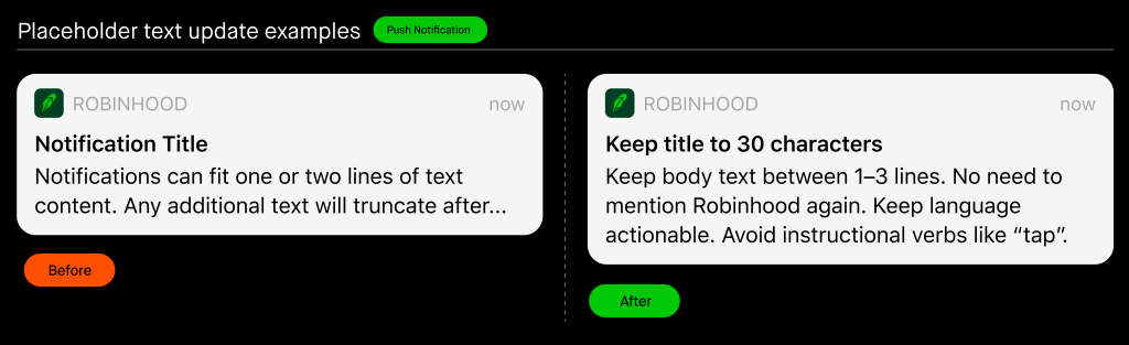
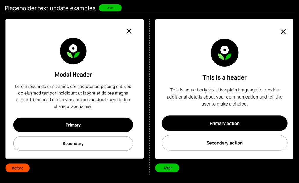
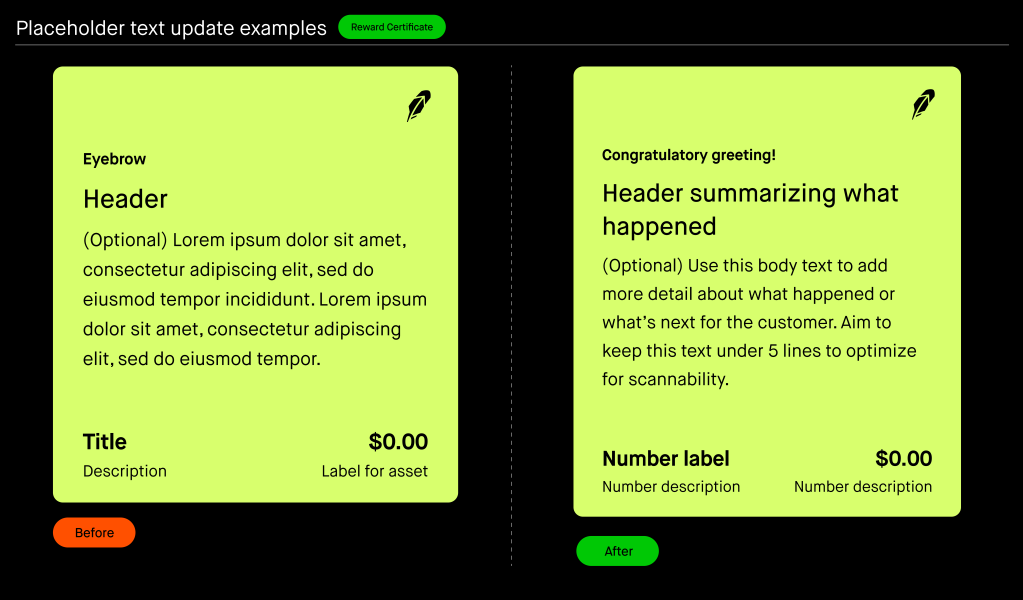
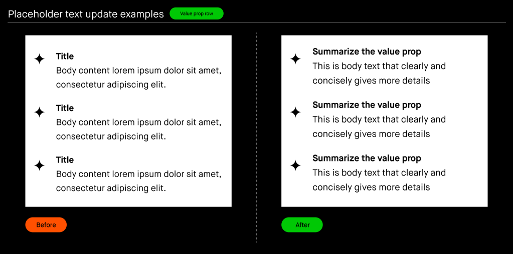
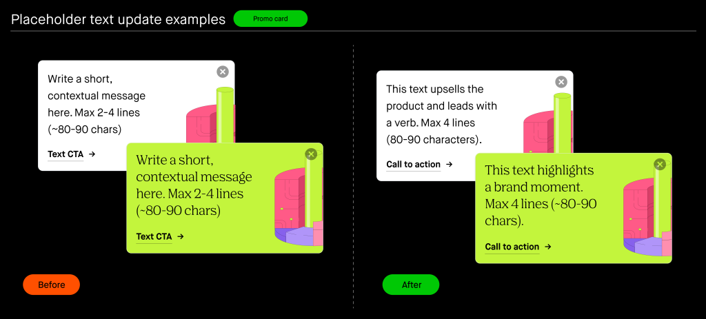
- Update component placeholder text – We identified this as a low-lift, high-impact way to make sure components are replicated with our Content Standards already embedded into them. For example, by updating the placeholder text in a modal from “lorem ipsum” to helpful guidance for that component.
- Add component-specific content standards – Finally, I enlisted both Committee and non-Committee team members to pull over relevant, component-specific product Content Standards that could be transferred over to Bento. This included fresh guidance for push notifications, modals, bottom sheets, and many more components. Specifically, we included guidance on best practices, mechanics, content length and structure, and Do’s and Don’ts.
Placeholder text update examples
Here are just a few examples of how we gave placeholder text a Content Standards makeover.

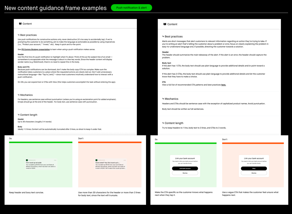
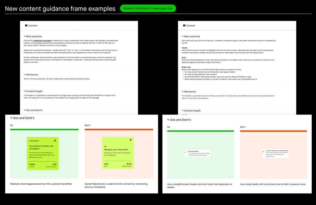
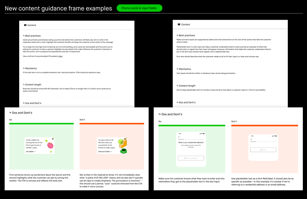
New content guidance frame examples
Since placeholder text didn’t give us enough real estate to give a full breakdown of Content Standards, I designed pages that matched Bento’s aesthetic and created categories for: best practices, mechanics, content length, and Do’s and Don’ts.
“Best practices” not only capture how to write for a component, but when to use it. For example, when to use a modal versus a banner, depending on the type of message and how we expect a user to engage with it.
New content pattern examples
As we worked through the three steps, we uncovered a need for content patterns that weren’t associated with just one type of component, but that needed to be consistent for a type of content. So we created content patterns for error messages and CTAs. Here are just a few examples:
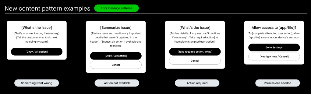
Error message patterns
Our error message patterns can be used to create consistent, effective errors. Since the user is already experiencing an error, we don’t want to frustrate them even more with vague or impersonal content. They help us avoid instances of non-user friendly language like “Error code: 1234” making its way into product copy. They also encourage specific guidance on how users can resolve the situation. Plus, as content designers, they help us make sure we’re not writing inconsistent messages across the app for the same issue.
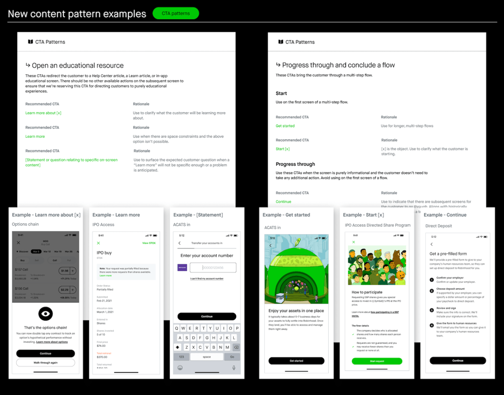
CTA patterns
Our CTA patterns capture common product experiences and the most effective CTAs for each of them.
The results
Our Content Standards are now available in both Bento mobile and web for the entire organization to use! With this update:
- Content designers can review Standards directly in Bento quickly, with less context switching.
- Product designers have new content resources they can easily reference when designing independently.
- Inconsistencies and Standards violations—like title case buttons—are caught early instead of weeks or months later.
- There’s less confusion on which component is the best way to deliver content thanks to new “best practices.”
In the annual Bento survey, 88% of product designers found the Content Standard work helpful. On a more personal level, I’ve had multiple product and content designers tell me how helpful they find these updates in their own work, and that feels amazing. Here are a few quotes from team members:
“Bento Content guidance is a must-have for me to check out when I’m in the early exploration stage. I find that the Do’s and Don’ts are especially helpful as a product designer to quickly come up with something in the right framework, which enables me to explore broadly and move fast. I also appreciate that we have the right placeholder content in Bento components, which is super convenient!”
- Rachel Jin, Senior Product Designer
“Within our Bento survey, respondents said that they value / like the new content guidelines within our library.”
- Neil LaVigne, Staff Product Designer
“This is a really big deal and something I’ve been wanting since the first day I joined. It’s great to see this achieved.”
- Andy Montgomery, VP of Design, Creative, Research
Up next, we plan to add content patterns for empty states, success messages, and refine our existing error message patterns to include error severity and surface type.
A big thank you to all the people who brought this project to life: Amelia Goldberg, Andrew Lipstein, Ashley Soderberg, Benice Atufunwa, Cassie Kjorness, Danielle Lavigne, Doreen Du, Jenna Garden, Jon Brennan, Joshua Lee, Michele Dehmer, Natalie Jarrett, Neil LaVigne, Selene De La Cruz, and Shawn Roe.
Now our design system truly serves our full design team — product design and content design!
…
We are always looking for more individuals who share our commitment to building a diverse team and creating an inclusive environment as we continue in our journey in democratizing finance for all. Stay connected with us — join our talent community and check out our open roles!
…
© 2023 Robinhood Markets, Inc.
…
3247899
Related news